# Branding the Authenticator App
Page contents
# About Branding the Authenticator App
It is possible to customise certain elements of the Authenticator App with your own branding. You can do this by supplying us with the necessary resources for each mobile platform.
# What can you customise?
You can customise elements such as:
- The name of the app.
- The application icon.
- The logo on the welcome page and home page.
- The colour value for various elements within the app, such as the toolbar, button colour and background colour.
- The launch image or splash screen, which is displayed during the launch of the app.
- The notification icon.
- The help page.
Please see sections below for details on each element.
# App name
The name of the app, which is used in messages to the end-user.
Example
"Enable push notifications for Signicat Authenticator".
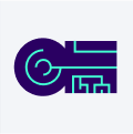
# App icon
The icon of the app.
Example: App icon
# App icon sizes for iOS
- 120 px x 120 px (@2x)
- 180 px x 180 px (@3x)
# App icon for Android
For Android we support adaptive icons. Adaptive icons can display differently depending on the individual device capabilities and user theming. You can read more about adaptive icons in the Android developer documentation (opens new window).
The adaptive icon must meet the following design requirements:
- An adaptive icon must be supplied as two layers, which are preferably vector images:
- The foreground layer, which is the icon itself.
- The background layer.
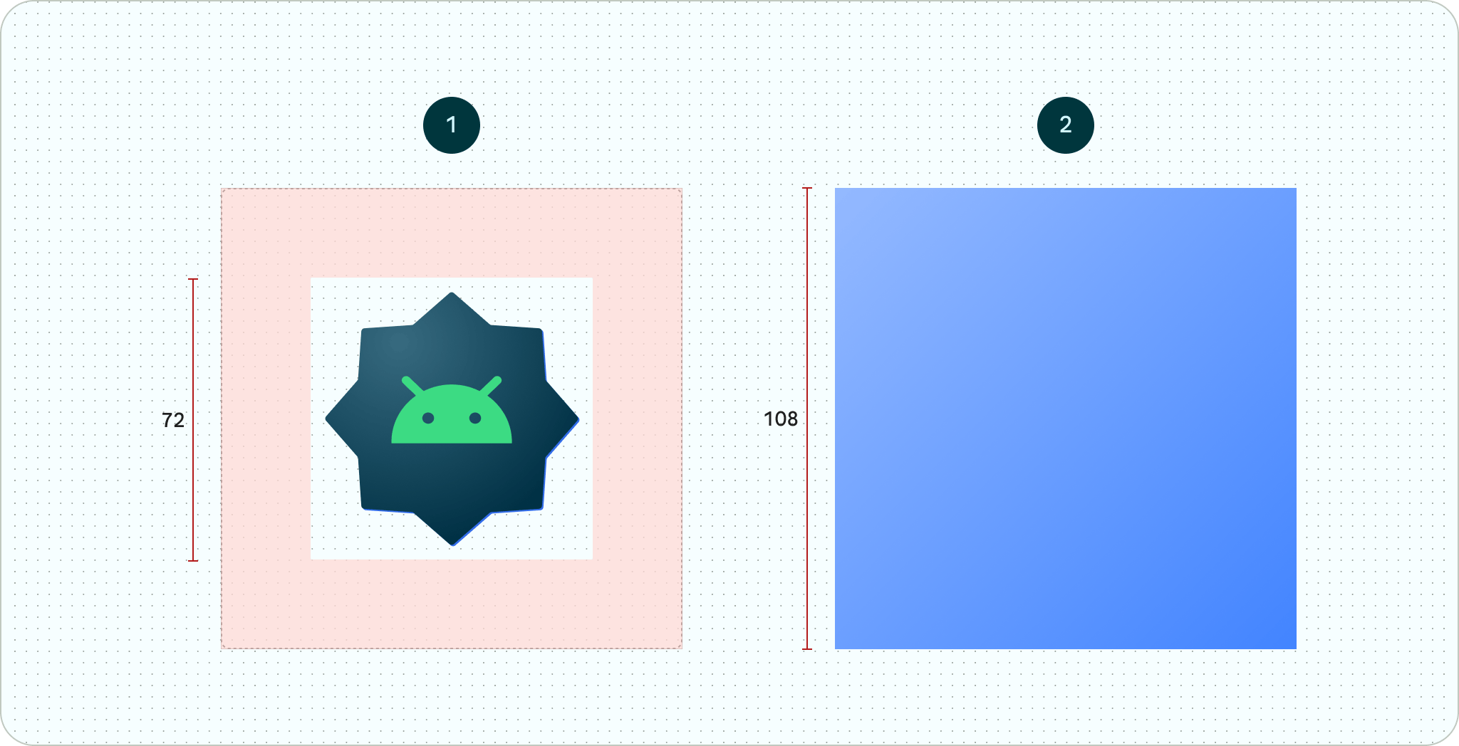
Note
This diagram shows an adaptive icon defined using foreground and background layers.
The 72 dp x 72 dp safe zone shows where your icon and foreground layers will never be clipped by a shaped mask defined by an OEM.
- All layers should be sized at 108 dp x 108 dp.
- The foreground layer should be at least 48 dp x 48 dp, and should not exceed the 72 dp x 72 dp safe area.
- The background layer should be sized at 108 dp x 108 dp, and can be either:
- An image.
- A colour, given in a hexadecimal colour code format. For example, #451621.
- Optionally, a monochrome icon can be provided for supported Android launchers. This allows the app icon to inherit the colour of the end-user's chosen wallpaper and other themes.
You can learn how to create and export an adaptive icon for Android using an example template in Figma's documentation (opens new window).
# Company logo
The logo that is used on the welcome page, the home page, and optionally the launch screen for iOS.
To get the best result, we advise that you supply a high-quality version of your company logo with a transparent background. The allowed file format of the supplied logo varies depending on the target platform. See sections below for details.
Example: Company logo
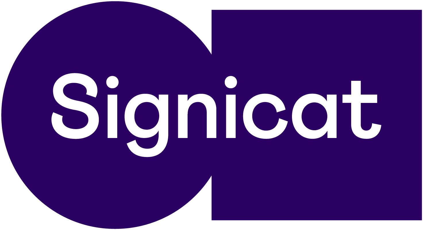
# iOS allowed file formats
You can supply a high-quality version of your company logo in any of the following formats:
- PDF (.pdf)
- PNG (.png)
Our recommendation
We recommend that you use the PDF file format, as this scales better than PNG files.
# Android recommended file formats
You can supply a high-quality version of your company logo as either:
- SVG (.svg)
- High-resolution image file
# Colour
You can specify the colour for certain elements within the app. The colour value needs to be in a hexadecimal colour code format.
Example
Button colour #451621.
# Customisable elements
| Element | Description |
| Navigation bar colour | Used for the background in the header of the application. |
| Status bar colour | Used for the background in the status bar of the device. Note: If not provided, we will us the same colour as the navigation bar. |
| Button colour | Used for all accept buttons. |
| Background colour | Used for the background of all pages. |
# Launch screen or splash screen
The screen that is displayed when the app is being launched.
- For iOS it is called the launch screen.
- For Android it is called the splash screen.
To get the best result, we advise that you supply a high-quality version of your icon or image with a transparent background. The allowed file format of the supplied asset varies depending on the target platform. See sections below for details.
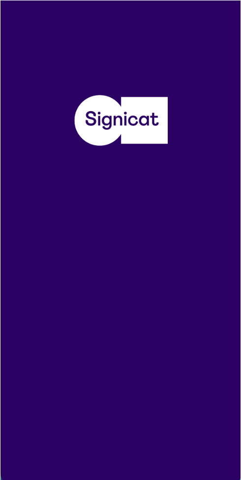
# Launch screen for iOS
For the launch screen on iOS, we use an image on a background. You can supply your own image, and you can also specify the background colour.
Example: Launch screen for iOS
# Customisable elements
| Element | Description |
| Image | An image, in high quality, to be used on the launch screen. Note: If not provided, we will use your company logo |
| Background colour | The background colour for the launch screen. This needs to be in a hexadecimal colour code format. |
# iOS allowed file formats
You can supply a high-quality version of your launch image in any of the following formats:
- PDF (.pdf)
- PNG (.png)
Our recommendation
We recommend that you use the PDF file format, as this scales better than PNG files.
# Splash screen for Android
For the splash screen on Android, you can choose whether this is customised or not.
For customised splash screens, you can:
Add a custom logo
Specify the background colour
Optionally add a branding logo if required.
The branding logo is displayed on the bottom of the screen and has a rectangular aspect ratio.
If no custom icon for the splash screen is provided, then the application icon will be used by default.
Want to learn more?
You can read more about splash screens in the Android developer documentation (opens new window).
Example: Splash screen for Android
# Customisable elements
| Element | Description |
| Icon | The icon that appears in the centre of the splash screen. This can be animated, and follows the same specifications as the adaptive icon. Note: If a custom icon is not provided, then the application icon will be used by default. |
| Background colour | The background colour for the splash screen. This needs to be in a hexadecimal colour code format. |
| Branding logo | The branding logo that appears at the bottom of the splash screen. Note: This asset is optional. |
# Branding logo considerations
You should consider the following when choosing a branding logo:
- It should be no wider than 200 dp, and no taller than 80 dp.
- We advise that you supply it as either an SVG (.svg) or a high-resolution image file.
- It should be in a rectangular aspect ratio. Branding logos formatted as squares or circles are likely to be cut off.
# Notification icon
The small icon that is displayed in a notification when a push message to start the app arrives. This notification is visible when the app is not already running in the foreground.
Notification icons for iOS
For iOS, a smaller version of the app icon is used.
# Notification icon sizes for Android
You have to supply the notification icon with a transparent background.
- 24 px x 24 px (mdpi)
- 36 px x 36 px (hdpi)
- 48 px x 48 px (xhdpi)
- 72 px x 72 px (xxhdpi)
- 96 px x 96 px (xxxhdpi)
# Help page
Our Authenticator App has support for an optional help page, which can contain useful contact information for your end-users.
You can navigate to the help page from either the welcome screen or the menu within the app.
This page is only visible if you supply any of the supported help details shown in the table below.
# Help details
| Detail | Description |
| An email address that the end-users can reach out to if they need to get in contact with your company. | |
| Website | A link to your website. |
| Phone | A phone number that the end-users can reach out to if they need to get in contact with your company. |
# Branding checklist
You can find a checklist of all branding details that you need to share with us in the table below, in addition to an example of each.
You can share the assets with us at support@signicat.com.
| Branding asset | Example |
| Application name | Signicat Authenticator |
| Application icon | Attach files |
| Company logo | Attach file |
| Colour |
|
| Launch screen (iOS) |
|
| Splash screen (Android) |
|
| Notification icon | Attach file |
| Help page (optional) |
|